
Compose Photos using Colour Harmony
There are various factors to consider when you compose photos. The most important thing is to ask yourself if everything in the picture contributes to what you want to say. Does it seem to be effective? The various “rules” of composition are just tools to help you achieve that. Elsewhere we have considered some of the basic principles of how to compose a photo. In this post we will be looking at the use of colour harmony as a tool for composition. This is not a rule that you have to obey. It is an idea that can help you achieve certain effects.

The principle of colour harmony is very simple. Similar colours or complementary colours look natural together. They can give an image a settled feeling. It is as if the elements belong together. Colours that are not harmonious tend to stand out and draw attention. So, you can use this to your advantage either way. When you want something to stand out you might go for a bold, different colour. When you want an image to look like everything naturally works and belongs you could use colour harmony. You might choose to match clothing colour to something in the landscape or backdrop. You could find colours around you that match hair colour too, for example.

The above image shows that this can work with a range of subjects. Here we see the yellow and orange colours on the bee echoed in the flowers in the foreground and also in the blurred orange flowers in the background. You can use the idea when you compose photos of almost any subject. Some setting are easier to control, of course. When working with people you can suggest clothing, make-up or accessories that would give harmonious colours to an image. For shots such as the one of the bee above you need to look for environmental factors that can aid your composition.

In the picture above you can see that there is colour harmony throughout. I added a red gel to create the pink background in the studio. This matches the clutch as well as parts of her makeup and hair styling. The risk you take with colour harmony is that things could look bland. So, it is often an idea to have some other colour in there, maybe a complementary colour or maybe another, to lift the image a bit. The makeup around the eyes plays that role in this image. It also helps to draw our attention to the face while the image still feels balanced overall.

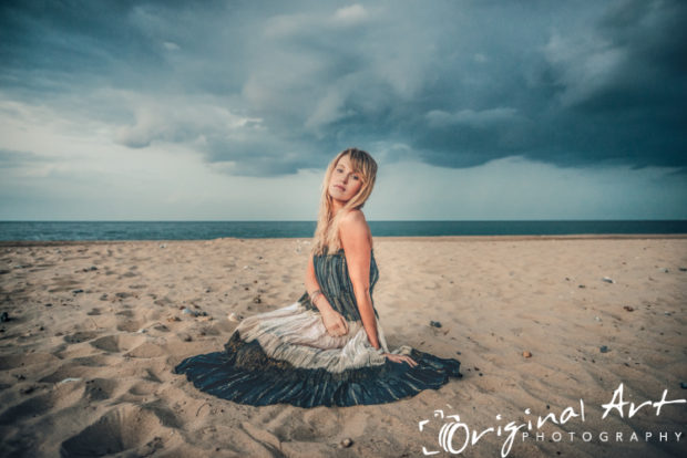
In our final image we see echoes of not only the colours but also the patterns from the dress in the background. Despite them both being quite busy, this harmony of colours and patterns helps them to work together rather than fighting for attention.
If you want to compose photos that look balanced and natural then colour harmony is a powerful tool. A good understanding of colour can help you to direct the viewer’s attention. It can also help you to create tension in an image or to stop that tension from being there. You will need to pay close attention to details. Look carefully around the frame before pressing the shutter. If you are going to compose photos and not just click away then you should be doing this anyway! I would encourage you to practise a few shots so that you get more aware of colour harmony. Then it should be easier to spot it and create it wherever you are.
© Joe Lenton, August 2016
Pingback: Light Leaks, Lens Flare & Colour Overlays - adding colour effects